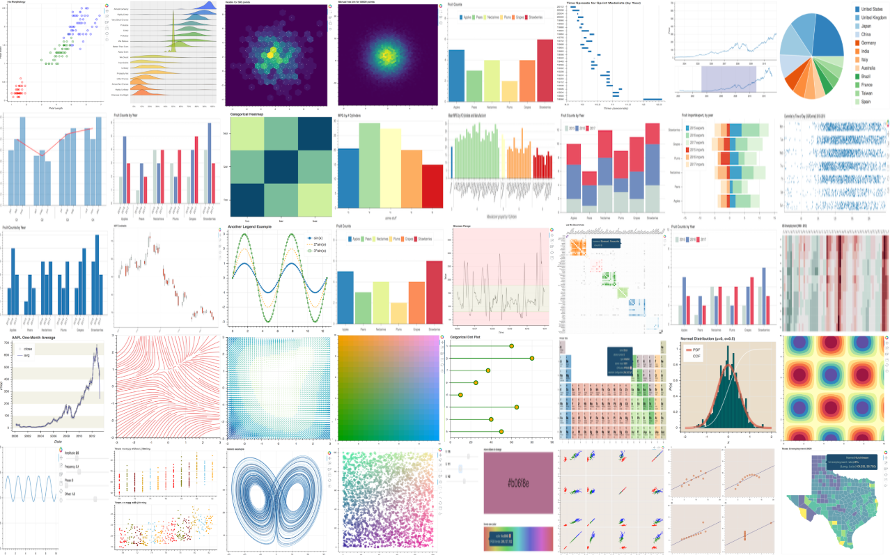
Interactive plotting with Bokeh

As a JupyterLab heavy user, I like using Bokeh for plotting because of its interactive plots. JupyterLab also offers an extension for interactive matplotlib, but it is slow and it crashes with bigger datasets.
A thing I don’t like about Bokeh is its overwhelming documentation and complex examples. Sometimes I want to make a simple line plot and I struggle with 10 or more lines of Bohek specific code. But Bokeh code can be very concise as I am going to show below. This is also the main goal, to show a few useful data visualizations with as little code as possible.
Haven’t heard of Bokeh? Description from its website sums it up nicely:
Bokeh is an interactive visualization library that targets modern web browsers for presentation. Its goal is to provide elegant, concise construction of versatile graphics, and to extend this capability with high-performance interactivity over very large or streaming datasets. Bokeh can help anyone who would like to quickly and easily create interactive plots, dashboards, and data applications.
You can run this code by downloading this Jupyter notebook.
Here are a few links you might be interested in:
- Intro to Machine Learning
- Intro to Programming
- Data Science for Business Leaders
- AI for Healthcare
- Autonomous Systems
- Learn SQL
Disclosure: Bear in mind that some of the links above are affiliate links and if you go through them to make a purchase I will earn a commission. Keep in mind that I link courses because of their quality and not because of the commission I receive from your purchases. The decision is yours, and whether or not you decide to buy something is completely up to you.
Requirements
import bokeh
import numpy as np
from bokeh.models import Circle, ColumnDataSource, Line, LinearAxis, Range1d
from bokeh.plotting import figure, output_notebook, show
from bokeh.core.properties import value

output_notebook()  # output bokeh plots to jupyter notebook
np.random.seed(42)
print("bokeh", bokeh.__version__)
print("numpy", np.__version__)
bokeh 1.0.4
numpy 1.15.1
Generata data
Let us generate some random data using numpy. Bokeh has its own data structure (ColumnDataSource) for data representation. I am not sure why they developed their own data structure as pandas and numpy are De facto standard in Python analytics world (enlighten me in the comments below if you know). But luckily it works also with pandas. For this blog post, I decided to write examples on Bokeh way with its data structures.
N = 100
data_source = ColumnDataSource(
    data=dict(
        x0=np.arange(N),
        x1=np.random.standard_normal(size=N),
        x2=np.arange(10, N + 10),
        x3=np.random.standard_normal(size=N),
    )
)
Simple line plot
To make a simple line plot in Bohek we need 3 lines of code. That’s not too bad. Note that the plot is interactive of the box, we can zoom in and move around, which is very useful with bigger datasets.
p = figure()
p.line("x0", "x1", source=data_source)
show(p)
Line plot with two axes
To visualize two data columns with different ranges on a plot we can use two separate y-axes. We can set y-axis ranges but that’s not required. I used the min and max values of a data column as a y-axis limit. To visually separate data columns we can add a legend and set the color.
p = figure()
column1 = "x1"
column2 = "x2"

# FIRST AXIS
p.line("x0", column1, legend=value(column1), color="blue", source=data_source)
p.y_range = Range1d(data_source.data[column1].min(), data_source.data[column1].max())

# SECOND AXIS
column2_range = column2 + "_range"
p.extra_y_ranges = {
    column2_range: Range1d(
        data_source.data[column2].min(), data_source.data[column2].max()
    )
}
p.add_layout(LinearAxis(y_range_name=column2_range), "right")

p.line("x0", column2, legend=value(column2), y_range_name=column2_range, color="green",source=data_source)

show(p)
Combine line and scatter plot
This is where Bokeh really shines. You can simply define multiple elements and Bokeh renders them on the plot.
p = figure()
p.line(x="x0", y="x1",color="blue", source=data_source )
p.circle(x="x0", y="x3",color='green', source=data_source)
show(p)
Final thoughts
Bokeh is very customizable. You can tweak all the things you would expect from a plotting library, like line width, colors, multiple plots on a grid, etc. It offers special plots like candlesticks for financial data, Burtin visualization and you can even make a periodic table. Unique to Bokeh (at least to my knowledge) is an option to export the plot to javascript code which enables you to directly embed the plot to a webpage with all of its interactive capabilities.
What do you think about Bokeh? Let me know in the comments below.