Cryptocurrency Analysis with Python - Buy and Hold
In this part, I am going to analyze which coin (Bitcoin, Ethereum or Litecoin) was the most profitable in last two months using buy and hold strategy. We’ll go through the analysis of these 3 cryptocurrencies and try to give an objective answer.
You can run this code by downloading this Jupyter notebook.
Follow me on twitter to get latest updates.

Here are a few links you might be interested in:
- Intro to Machine Learning
- Intro to Programming
- Data Science for Business Leaders
- AI for Healthcare
- Autonomous Systems
- Learn SQL
Disclosure: Bear in mind that some of the links above are affiliate links and if you go through them to make a purchase I will earn a commission. Keep in mind that I link courses because of their quality and not because of the commission I receive from your purchases. The decision is yours, and whether or not you decide to buy something is completely up to you.
Disclaimer
I am not a trader and this blog post is not a financial advice. This is purely introductory knowledge. The conclusion here can be misleading as we analyze the time period with immense growth.
Requirements
For other requirements, see my previous blog post in this series.
Getting the data
To get the latest data, go to previous blog post, where I described how to download it using Cryptocompare API. You can also use the data I work with in this example.
First, we download hourly data for BTC, ETH and LTC from Coinbase exchange. This time we work with hourly time interval as it has higher granularity. Cryptocompare API limits response to 2000 samples, which is 2.7 months of data for each coin.
import pandas as pd

def get_filename(from_symbol, to_symbol, exchange, datetime_interval, download_date):
    return '%s_%s_%s_%s_%s.csv' % (from_symbol, to_symbol, exchange, datetime_interval, download_date)

def read_dataset(filename):
    print('Reading data from %s' % filename)
    df = pd.read_csv(filename)
    df.datetime = pd.to_datetime(df.datetime) # change type from object to datetime
    df = df.set_index('datetime')
    df = df.sort_index() # sort by datetime
    print(df.shape)
    return df
Load the data
df_btc = read_dataset(get_filename('BTC', 'USD', 'Coinbase', 'hour', '2017-12-24'))
df_eth = read_dataset(get_filename('ETH', 'USD', 'Coinbase', 'hour', '2017-12-24'))
df_ltc = read_dataset(get_filename('LTC', 'USD', 'Coinbase', 'hour', '2017-12-24'))
Reading data from BTC_USD_Coinbase_hour_2017-12-24.csv
(2001, 6)
Reading data from ETH_USD_Coinbase_hour_2017-12-24.csv
(2001, 6)
Reading data from LTC_USD_Coinbase_hour_2017-12-24.csv
(2001, 6)
df_btc.head()
| low | high | open | close | volumefrom | volumeto | |
|---|---|---|---|---|---|---|
| datetime | ||||||
| 2017-10-02 08:00:00 | 4435.00 | 4448.98 | 4435.01 | 4448.85 | 85.51 | 379813.67 |
| 2017-10-02 09:00:00 | 4448.84 | 4470.00 | 4448.85 | 4464.49 | 165.17 | 736269.53 |
| 2017-10-02 10:00:00 | 4450.27 | 4469.00 | 4464.49 | 4461.63 | 194.95 | 870013.62 |
| 2017-10-02 11:00:00 | 4399.00 | 4461.63 | 4461.63 | 4399.51 | 326.71 | 1445572.02 |
| 2017-10-02 12:00:00 | 4378.22 | 4417.91 | 4399.51 | 4383.00 | 549.29 | 2412712.73 |
Extract closing prices
We are going to analyze closing prices, which are prices at which the hourly period closed. We merge BTC, ETH and LTC closing prices to a Dataframe to make analysis easier.
df = pd.DataFrame({'BTC': df_btc.close,
                   'ETH': df_eth.close,
                   'LTC': df_ltc.close})
df.head()
| BTC | ETH | LTC | |
|---|---|---|---|
| datetime | |||
| 2017-10-02 08:00:00 | 4448.85 | 301.37 | 54.72 |
| 2017-10-02 09:00:00 | 4464.49 | 301.84 | 54.79 |
| 2017-10-02 10:00:00 | 4461.63 | 301.95 | 54.63 |
| 2017-10-02 11:00:00 | 4399.51 | 300.02 | 54.01 |
| 2017-10-02 12:00:00 | 4383.00 | 297.51 | 53.71 |
Analysis
Basic statistics
In 2.7 months, all three cryptocurrencies fluctuated a lot as you can observe in the table below.
For each coin, we count the number of events and calculate mean, standard deviation, minimum, quartiles and maximum closing price.
Observations
- The difference between the highest and the lowest BTC price was more than $15000 in 2.7 months.
- The LTC surged from \$48.61 to $378.66 at a certain point, which is an increase of 678.98%.
df.describe()
| BTC | ETH | LTC | |
|---|---|---|---|
| count | 2001.000000 | 2001.000000 | 2001.000000 |
| mean | 9060.256122 | 407.263793 | 106.790100 |
| std | 4404.269591 | 149.480416 | 89.142241 |
| min | 4150.020000 | 277.810000 | 48.610000 |
| 25% | 5751.020000 | 301.510000 | 55.580000 |
| 50% | 7319.950000 | 330.800000 | 63.550000 |
| 75% | 11305.000000 | 464.390000 | 100.050000 |
| max | 19847.110000 | 858.900000 | 378.660000 |
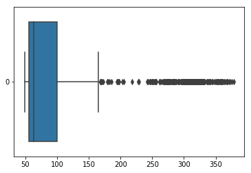
Lets dive deeper into LTC
We visualize the data in the table above with a box plot. A box plot shows the quartiles of the dataset with points that are determined to be outliers using a method of the inter-quartile range (IQR). In other words, the IQR is the first quartile (25%) subtracted from the third quartile (75%).
On the box plot below, we see that LTC closing hourly price was most of the time between \$50 and \$100 in the last 2.7 months. All values over \$150 are outliers (using IQR). Note that outliers are specific to this data sample.
import seaborn as sns

ax = sns.boxplot(data=df['LTC'], orient="h")
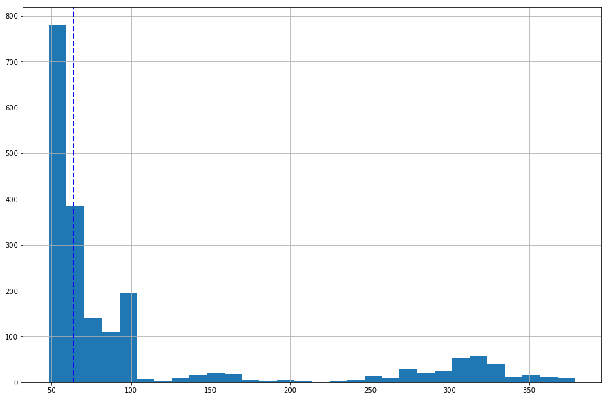
Histogram of LTC closing price
Let’s estimate the frequency distribution of LTC closing prices. The histogram shows the number of hours LTC had a certain value.
Observations
- LTC closing price was not over $100 for many hours.
- it has right-skewed distribution because a natural limit prevents outcomes on one side.
- blue dashed line (median) shows that half of the time closing prices were under $63.50.
df['LTC'].hist(bins=30, figsize=(15,10)).axvline(df['LTC'].median(), color='b', linestyle='dashed', linewidth=2)
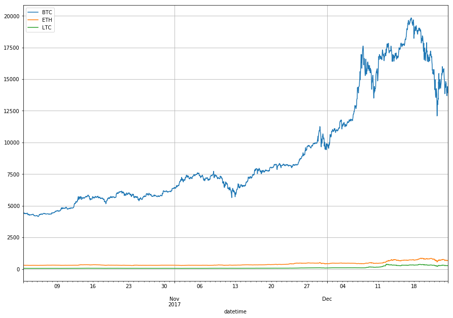
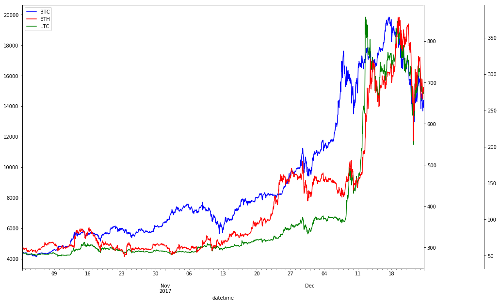
Visualize absolute closing prices
The chart below shows absolute closing prices. It is not of much use as BTC closing prices are much higher then prices of ETH and LTC.
df.plot(grid=True, figsize=(15, 10))
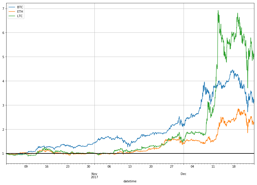
Visualize relative changes of closing prices
We are interested in a relative change of the price rather than in absolute price, so we use three different y-axis scales.
We see that closing prices move in tandem. When one coin closing price increases so do the other.
import matplotlib.pyplot as plt
import numpy as np

fig, ax1 = plt.subplots(figsize=(20, 10))
ax2 = ax1.twinx()
rspine = ax2.spines['right']
rspine.set_position(('axes', 1.15))
ax2.set_frame_on(True)
ax2.patch.set_visible(False)
fig.subplots_adjust(right=0.7)

df['BTC'].plot(ax=ax1, style='b-')
df['ETH'].plot(ax=ax1, style='r-', secondary_y=True)
df['LTC'].plot(ax=ax2, style='g-')

# legend
ax2.legend([ax1.get_lines()[0],
            ax1.right_ax.get_lines()[0],
            ax2.get_lines()[0]],
           ['BTC', 'ETH', 'LTC'])
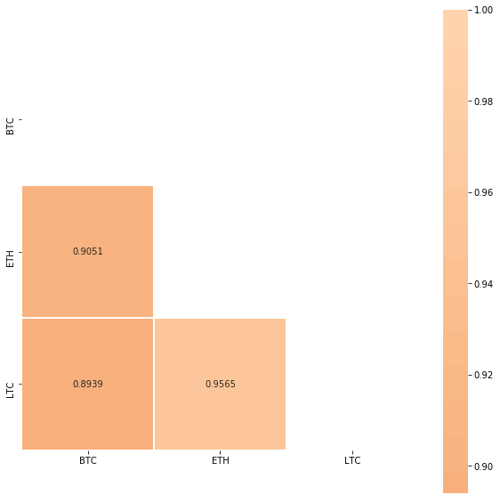
Measure correlation of closing prices
We calculate Pearson correlation between closing prices of BTC, ETH and LTC. Pearson correlation is a measure of the linear correlation between two variables X and Y. It has a value between +1 and −1, where 1 is total positive linear correlation, 0 is no linear correlation, and −1 is total negative linear correlation. Correlation matrix is symmetric so we only show the lower half.
Sifr Data daily updates Pearson correlations for many cryptocurrencies.
Observations
- Closing prices aren’t normalized, see Log Returns, where we normalize closing prices before calculating correlation,
- BTC, ETH and LTC were highly correlated in past 2 months. This means, when BTC closing price increased, ETH and LTC followed.
- ETH and LTC were even more correlated with 0.9565 Pearson correlation coefficient.
import seaborn as sns
import matplotlib.pyplot as plt

# Compute the correlation matrix
corr = df.corr()

# Generate a mask for the upper triangle
mask = np.zeros_like(corr, dtype=np.bool)
mask[np.triu_indices_from(mask)] = True

# Set up the matplotlib figure
f, ax = plt.subplots(figsize=(10, 10))

# Draw the heatmap with the mask and correct aspect ratio
sns.heatmap(corr, annot=True, fmt = '.4f', mask=mask, center=0, square=True, linewidths=.5)
Buy and hold strategy
Buy and hold is a passive investment strategy in which an investor buys a cryptocurrency and holds it for a long period of time, regardless of fluctuations in the market.
Let’s analyze returns using buy and hold strategy for past 2.7 months. We calculate the return percentage, where $t$ represents a certain time period and $price_0$ is initial closing price:
\[return_{t, 0} = \frac{price_t}{price_0}\]df_return = df.apply(lambda x: x / x[0])
df_return.head()
| BTC | ETH | LTC | |
|---|---|---|---|
| datetime | |||
| 2017-10-02 08:00:00 | 1.000000 | 1.000000 | 1.000000 |
| 2017-10-02 09:00:00 | 1.003516 | 1.001560 | 1.001279 |
| 2017-10-02 10:00:00 | 1.002873 | 1.001925 | 0.998355 |
| 2017-10-02 11:00:00 | 0.988909 | 0.995520 | 0.987025 |
| 2017-10-02 12:00:00 | 0.985198 | 0.987192 | 0.981542 |
Visualize returns
We show that LTC was the most profitable for time period between October 2, 2017 and December 24, 2017.
df_return.plot(grid=True, figsize=(15, 10)).axhline(y = 1, color = "black", lw = 2)
Conclusion
The cryptocurrencies we analyzed fluctuated a lot but all gained in a given 2.7 months period.
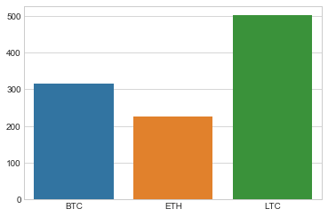
What is the percentage increase?
df_perc = df_return.tail(1) * 100
ax = sns.barplot(data=df_perc)
df_perc
| BTC | ETH | LTC | |
|---|---|---|---|
| datetime | |||
| 2017-12-24 16:00:00 | 314.688065 | 226.900488 | 501.407164 |
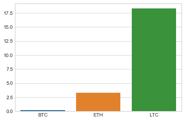
How many coins could we bought for $1000?
budget = 1000 # USD
df_coins = budget/df.head(1)

ax = sns.barplot(data=df_coins)
df_coins
| BTC | ETH | LTC | |
|---|---|---|---|
| datetime | |||
| 2017-10-02 08:00:00 | 0.224777 | 3.31818 | 18.274854 |
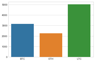
How much money would we make?
df_profit = df_return.tail(1) * budget

ax = sns.barplot(data=df_profit)
df_profit
| BTC | ETH | LTC | |
|---|---|---|---|
| datetime | |||
| 2017-12-24 16:00:00 | 3146.880655 | 2269.004878 | 5014.071637 |